Ten years ago, Sharp Egg, Inc created a design system for Houston Cinema Arts Festival. Through color, font, logo, and imagery, that system became the face of the festival, giving audiences something they could recognize and connect with, year after year. The original system needed the ability to expand to cover the fledging Festival’s evolving needs. It needed to be dynamic, changing from annually, but remaining familiar for the Festival’s returning fans. And, most importantly, it needed to adapt to incorporate images sent in by the filmmakers.
We achieved that through color, a simple but powerful element. The palette changed year after year, but many of the design elements, including font and logo, stayed consistent over the decade.
2018 marked HCAF’s tenth anniversary. As we celebrate a decade of collaboration, we have decided to mark the start of a new decade by updating the festival’s design system.
2019 marks the 100th anniversary of The Bauhaus, an art and design school founded by German architect Walter Gropius. Deeply influential in the fields of architecture, design, craft, and fine arts, the school sought to bring together all branches of the arts, breaking apart the hierarchy between craft and visual art. It encouraged wild and imaginative experimentation, and was organized with the shared idea that form should follow function.
Inspired by Bauhaus principles, we have redesigned the HCAF identity to emphasize our shared belief in the creative process across artistic disciplines. With films that explore the inner workings of the artistic process and artist’s lives, HCAF is devoted to arts education and an expanded definition of creative process.
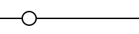
Merging the two aesthetics, the new design keeps the original HCAF fonts and adds an additional Bauhaus font into the mix. We have kept the original color coding system—the method for finding venues and dates, and organizing films by themes—intact. While Bauhaus colors tended towards primary, the colors in our current design stay true to HCAF’s palette. You might notice some other subtle changes: the design is now using images in black and white, rather than color tinting them. We have included more primary shapes, including circles and triangles. Images will often occupy the shapes. The new design reduces the number of ornamental elements we used in previous years. We are also incorporating more angles, drawing from Bauhaus graphic design.
We are also introducing Bauhaus-inspired icons to help you quickly determine which art practice the film/event falls under. A book icon marks films about literary arts; a lunar landing module signals space exploration; and a longhorn gets you to the Yeehaw Agenda. Form follows function.
Across the design world, we are celebrating the significance of the Bauhaus in everyday life, and revisiting its lessons. One of the fonts you are reading right now in the program guide was released recently in an Adobe initiative called Hidden Treasure, where designers finished fonts that were discovered in the Bauhaus archives in sketch form only. The font you see used for headers is Reross Quadratic, based on Reinhold Rossig’s original typography sketches and unpublished letters from 1929.
Indeed, the Bauhaus has been a subtle presence at HCAF since the beginning: if you are waiting for a screening to begin in the MFAH’s Brown Auditorium Theater, you are sitting in a room designed by the famous Bauhaus architect Ludwig Mies van der Rohe. If you are reading this sitting in a Le Corbusier Chaise Lounge, you may very well be in my living room and I would kindly ask you to leave… as soon as we decide what film you’re going to see next… Welcome to the 2019 Houston Cinema Arts Festival and I hope you love this new Bauhaus inspired program as much as we’ve loved designing it.
Written for the 2019 Houston Cinema Arts Festival Program